ROCHE Her Cancer Compass
Client: Roche
Date: September 2016
Tools: Illustrator CC,Photoshop CC
Format: Illustrations
Audience: Cancer patients and families
INTRODUCTION:
Roche was looking to update an existing eBook on breast cancer management. As a leading research company in breast cancer treatments, it was important for them to continue to also develop patient materials.
PROBLEM:
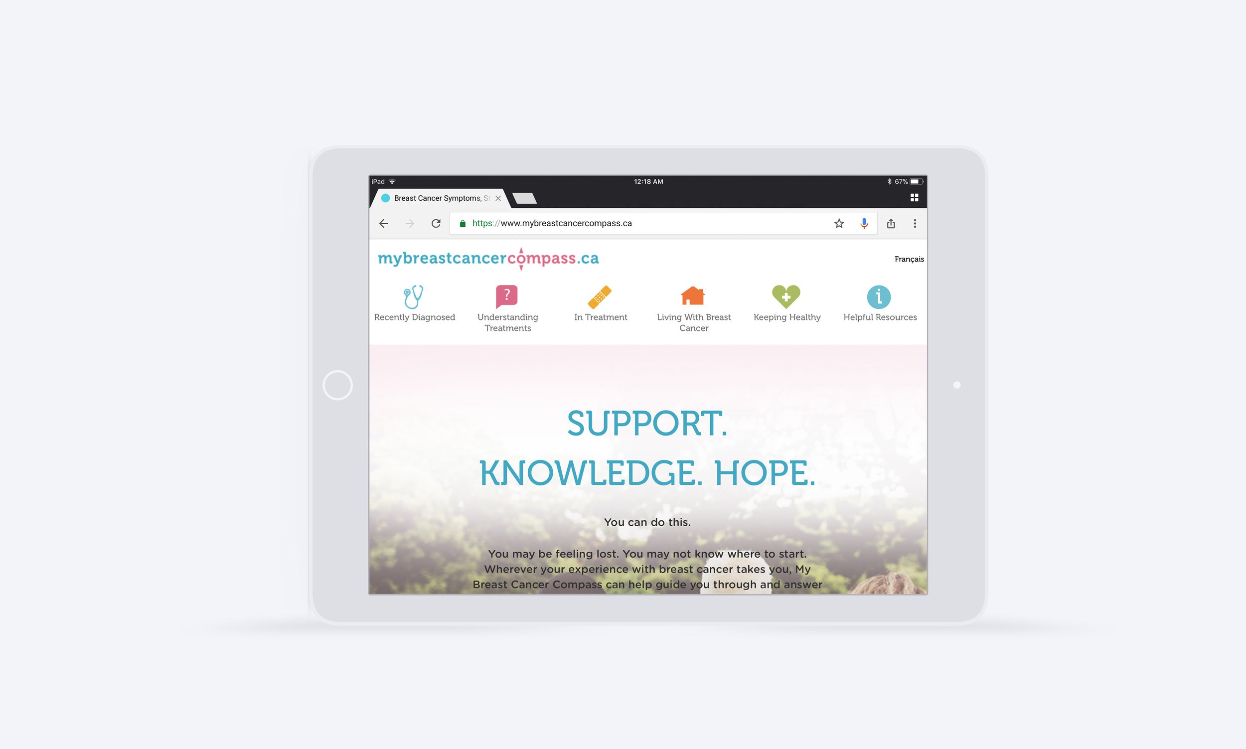
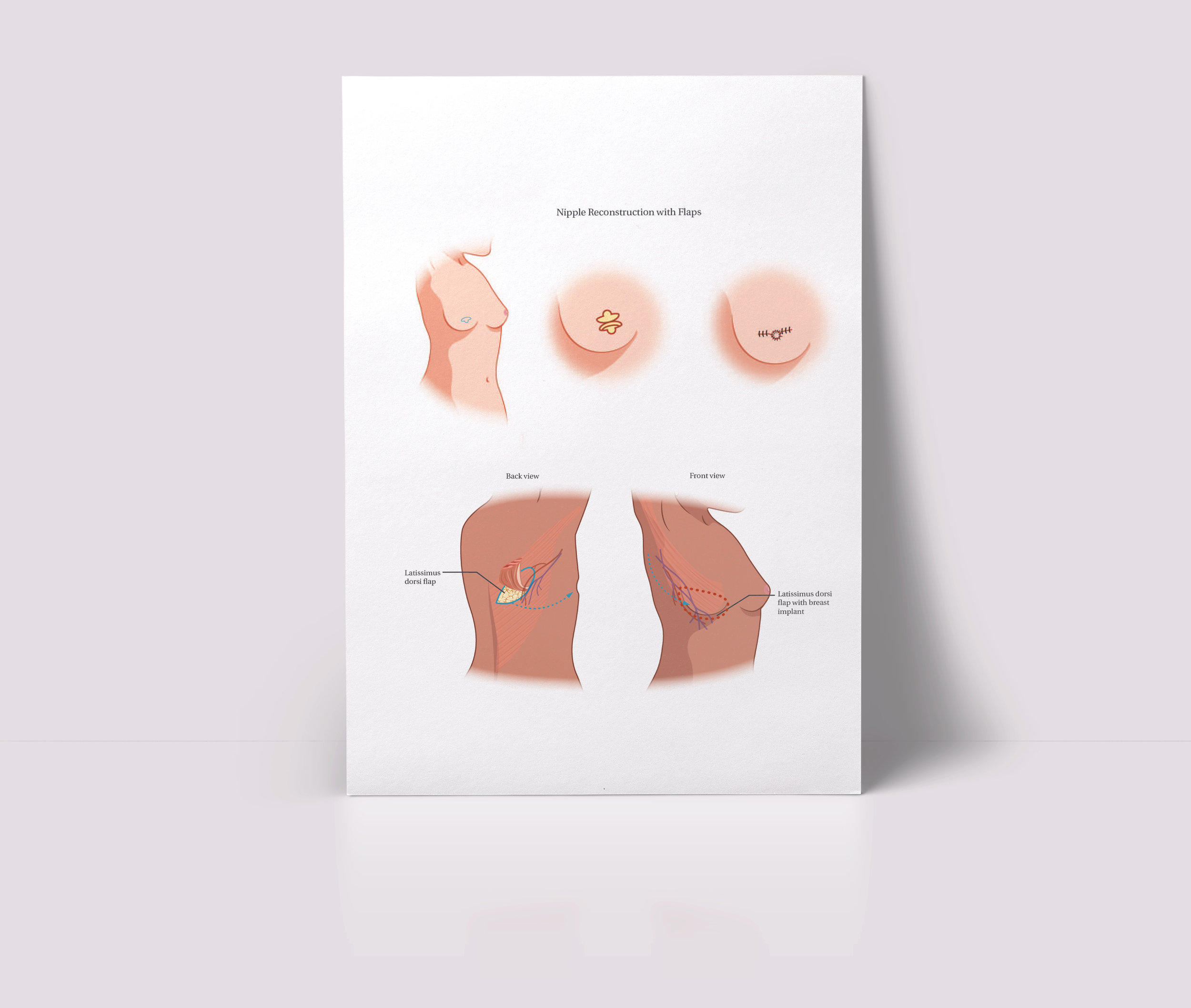
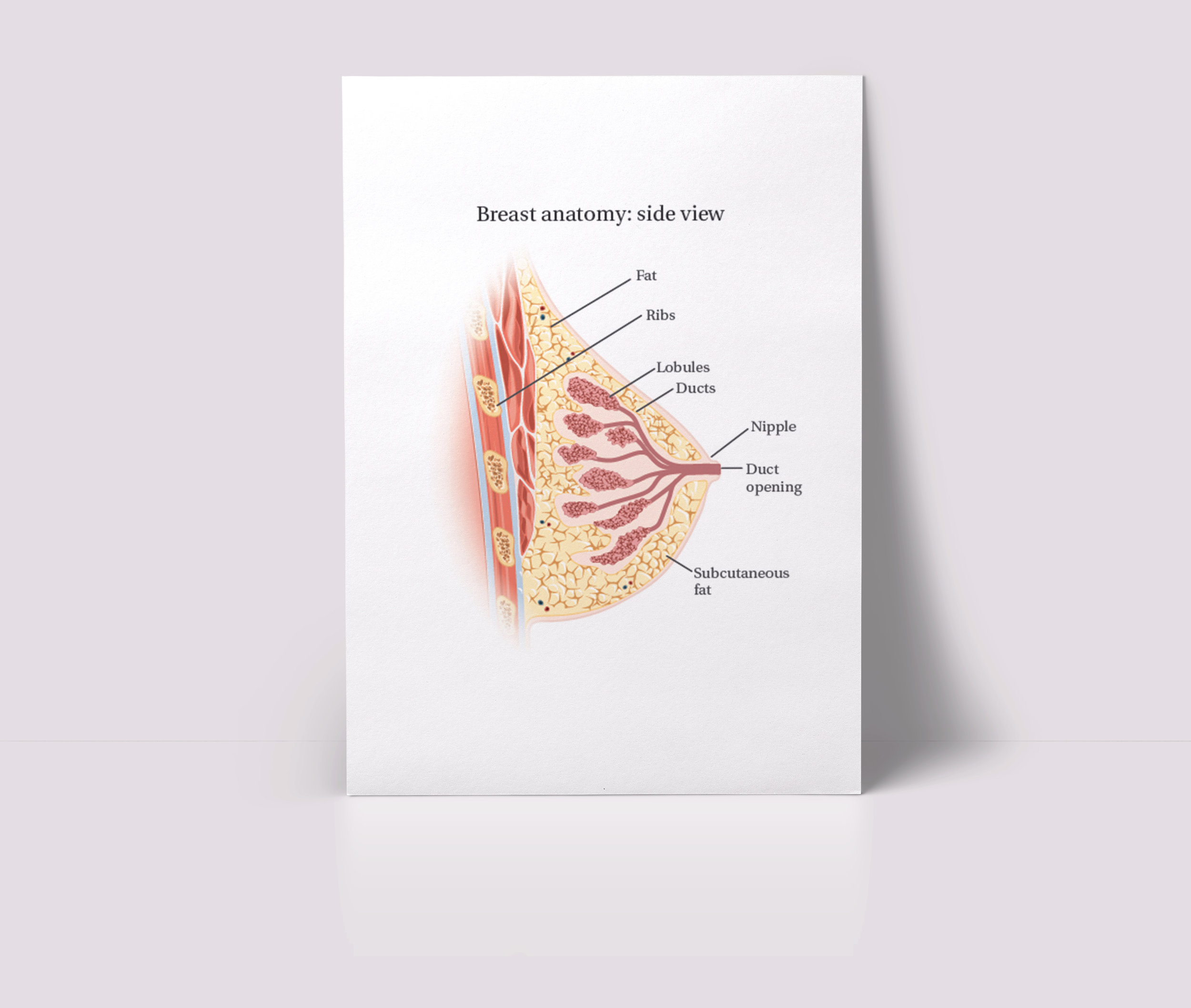
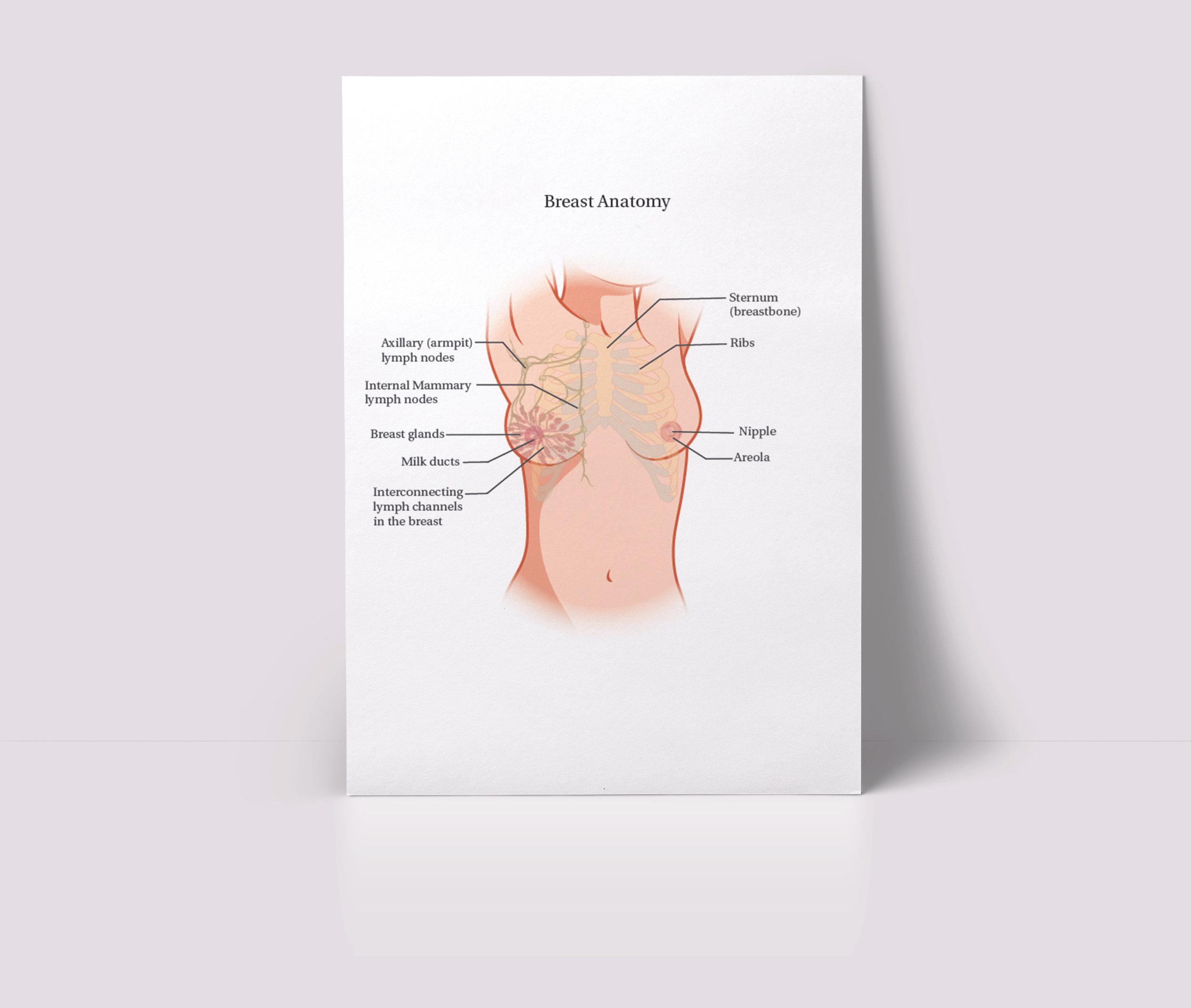
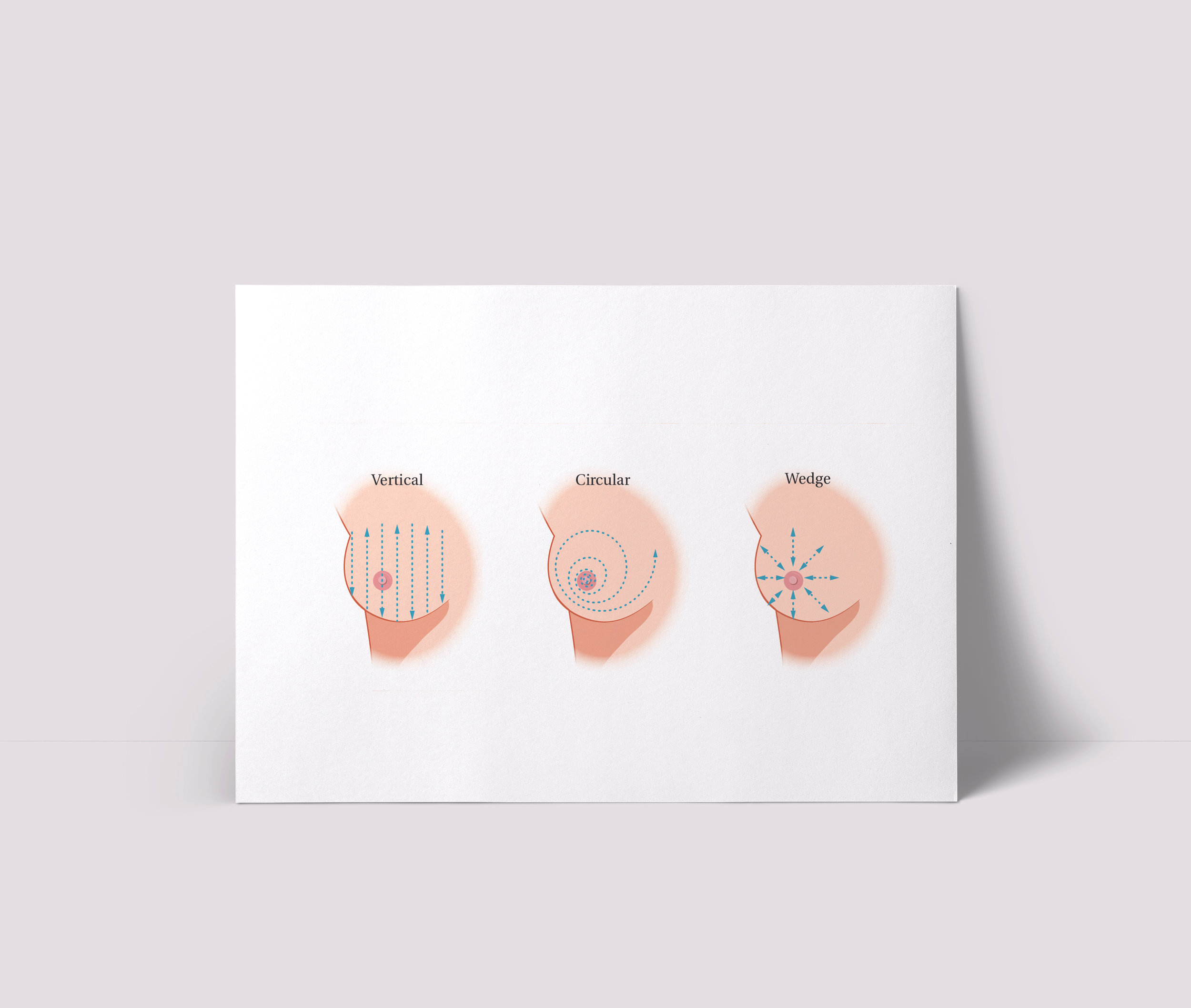
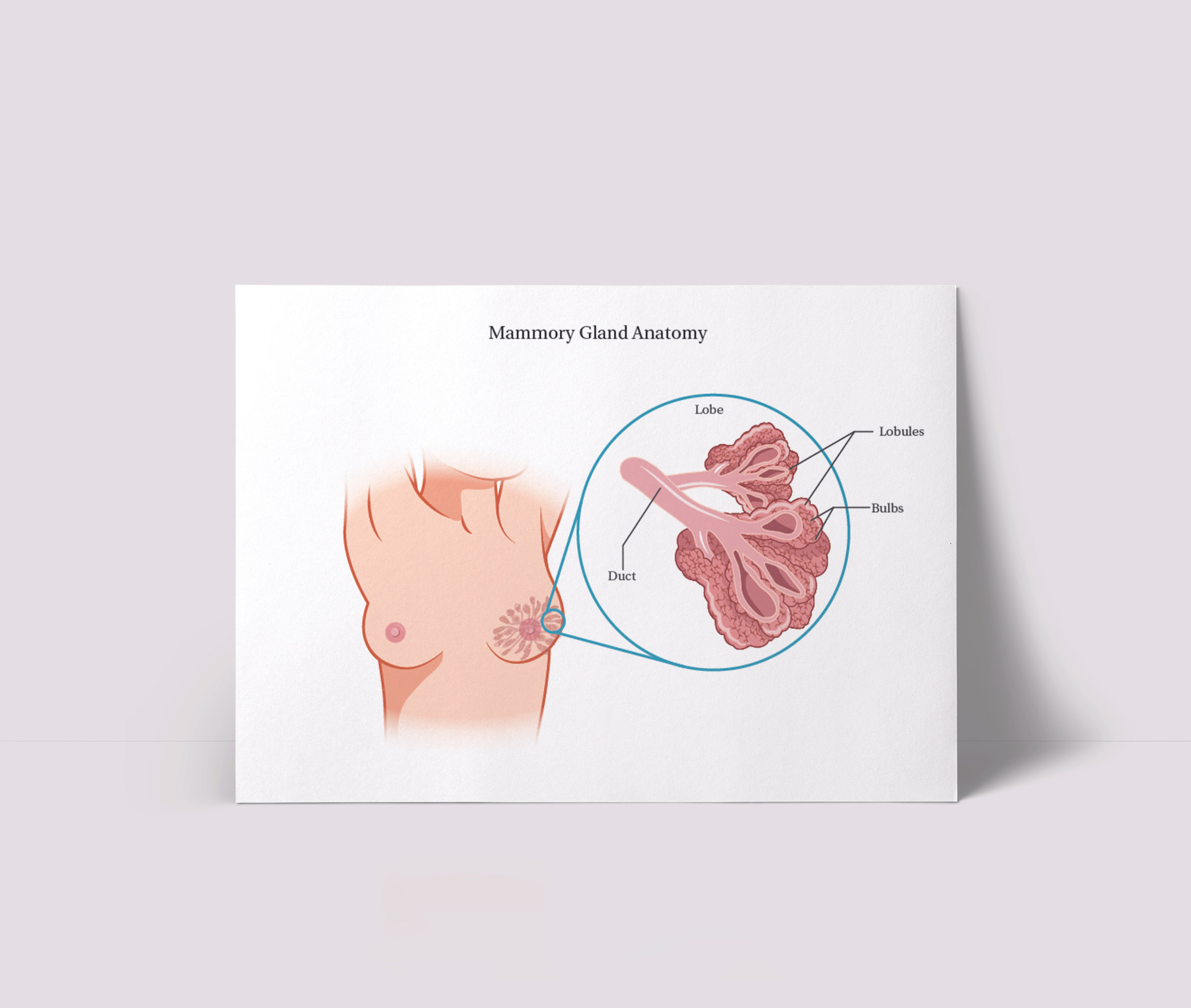
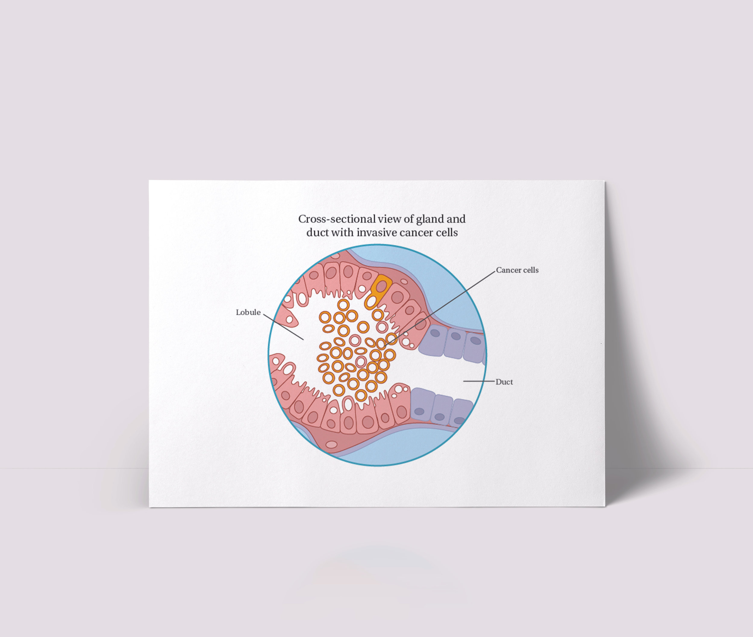
The previous style of illustration had been quite cold. Often, the feedback I’ve solicited from patients is that medical drawings can be frightening or alienating. The difficulty of educating oneself on how to manage cancer is only compounded by fear. The goal was to use a softer, more approachable colour palette and illustrations that were themselves friendlier and similar to other marketing campaigns.
SOLUTION/RESULTS:
To develop this softer illustration style I used vector based characters. The characters vary in ethnicity and age. The colour palette was used throughout the website and the My Cancer Compass website.
